What is a candlestick chart?
A candlestick chart shows the open, high, low and close for each period. Learn how to read a candle's body, wicks and colour, and why the interval matters.
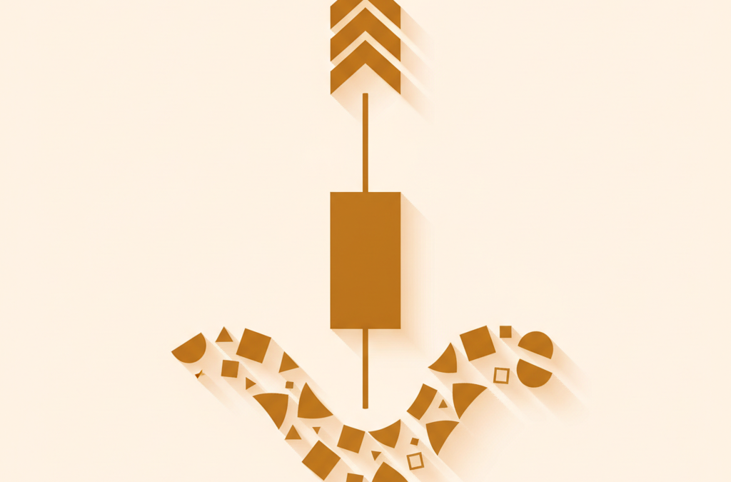
Mechanics, not signals. This explains how a market feature works. It is not a trading strategy, entry, target, or recommendation to buy or sell anything.
Quick answer
A candlestick chart displays price over time using bars that each summarise four values for one period: the open, high, low and close. The body spans the open and close, the wicks reach to the high and low, and the colour shows whether the period finished up or down.
Key points
- Each candle shows four prices: open, high, low, close (OHLC)
- The body spans open to close; wicks reach the high and low
- Green/hollow means close above open; red/filled means close below open
- Candle shape describes range and direction of a period, not the future
- The interval determines what each candle summarises, so always check it
A candlestick chart is a way of displaying price over time in which each bar, or “candle,” summarises four prices for a single period: the open, the high, the low, and the close. It is the default chart on most crypto exchanges because a single candle packs far more information than a plain line, which shows only one price per point in time.
This article explains what a candlestick shows and how to read one. It is educational only: it describes how the chart is constructed, not how to trade it. We deliberately do not cover candlestick “patterns,” entries, or strategy — only the mechanics of reading the four prices a candle represents.
What a candlestick chart shows: the four prices
Every candlestick represents one slice of time — a minute, an hour, a day, whatever the chart’s interval is set to — and encodes four values, together known as OHLC:
- Open — the price at the start of the period.
- High — the highest price reached during the period.
- Low — the lowest price reached during the period.
- Close — the price at the end of the period.
When the period ends, that candle is finished and a new one begins. A day chart draws one candle per day; a one-hour chart draws one per hour. Reading a candlestick chart is really just reading these four numbers, repeated across many periods.
The anatomy of a single candle
Each candle has two parts: a thick body and thin lines above and below it called wicks (also known as shadows or tails).
- The body spans the distance between the open and the close. Its top and bottom are those two prices; everything the price did between open and close falls inside the body.
- The wicks extend from the body to the high (upper wick) and to the low (lower wick). They mark the extremes the price touched during the period, even briefly.
So the full vertical range of a candle — wick tip to wick tip — is the trading range for that period, while the body shows where the period began and ended within that range.
Colour: up periods and down periods
Colour tells you the direction of the period at a glance, by comparing the close to the open:
- If the close is higher than the open, the period finished up. This candle is conventionally drawn in green (or left hollow/white). The open is at the bottom of the body, the close at the top.
- If the close is lower than the open, the period finished down. This candle is conventionally drawn in red (or filled/black). The open is at the top of the body, the close at the bottom.
The colours are a display convention and can be changed in most charting tools, but green-up / red-down is the near-universal default. Note that colour compares open and close only; a red candle can still have a high above the previous candle, and vice versa.
What the shape of a candle tells you
Because the body and wicks are drawn to scale, a candle’s shape describes how the period unfolded — without any interpretation beyond the four prices:
- A long body means the open and close were far apart: the price moved decisively in one direction over the period.
- A short body means the open and close were close together: the period ended near where it began.
- Long wicks mean the price travelled well beyond the open–close range at some point but did not finish there — it reached those extremes and came back.
- Little or no wick means the high or low was at or near the open or close, so the price did not push much past the body’s edge.
All of this is descriptive. It tells you what happened to price during a period; it does not tell you what will happen next.
The interval changes everything
The single most important setting on a candlestick chart is its interval (or timeframe). The same market looks completely different at one minute versus one day, because each candle is summarising a different amount of time. A one-day candle compresses a whole day’s opens, highs, lows and closes into one bar; a one-minute candle shows sixty times as much granular detail over the same hour.
This matters when comparing charts or reading someone else’s screenshot: a “big” candle on a one-minute chart may be a tiny blip on a daily chart. Always check the interval before drawing any conclusion from how a candle looks. Related structural context sits in how an order book works and what market liquidity means, since the trades that form each candle come from the order book.
Reading a sequence of candles
A single candle describes one period; the value of the chart comes from reading candles in sequence. Because each candle’s close sits next to the next candle’s open, you can follow how one period handed off to the next. A few purely descriptive observations follow from that:
- A run of same-coloured candles shows that successive periods each finished in the same direction — a stretch of consecutive up or down periods. It describes what has already happened, not what comes next.
- A gap occurs when a candle opens away from the previous candle’s close, meaning no trading is recorded between the two prices. Gaps are common on markets that close and reopen and rarer on crypto, which trades continuously.
- Changing candle sizes — bodies growing shorter or wicks growing longer — describe how the range and decisiveness of each period is shifting over time.
We deliberately stop at description here. Naming and trading specific multi-candle “patterns” is strategy, which is outside the scope of this explainer; the aim is only to read what the candles factually show.
Common intervals and when each is used
Charting tools let you switch the interval freely. The choice simply changes how much time each candle represents:
| Interval | Each candle covers | Typical use |
|---|---|---|
| 1m / 5m / 15m | One to fifteen minutes | Fine-grained intraday detail |
| 1h / 4h | One to four hours | Medium-term structure over days |
| 1d | One day | Longer-term view over weeks and months |
| 1w | One week | Broad, long-range perspective |
The same market can look calm on a weekly chart and frantic on a one-minute chart, because each is summarising a different amount of activity. Switching intervals is not changing the data, only the resolution at which you view it.
Candlesticks vs line and bar charts
A line chart connects a single price per period — usually the close — giving a clean but information-poor view. A candlestick shows four prices per period, so you can see not just where price ended but the range it covered and whether it finished up or down. A traditional OHLC bar chart shows the same four prices using ticks on a vertical line instead of a body; candlesticks simply make the open–close relationship easier to see through the coloured body. All three plot the same underlying data; they differ only in how much of it they reveal.
The bottom line
A candlestick chart turns raw price into a readable summary: each candle shows the open, high, low and close for one period, with a body between open and close and wicks reaching to the extremes, coloured to show whether the period finished up or down. Read the body for direction and range, the wicks for the extremes touched, and always confirm the interval. That is the full mechanics of reading candlesticks — a description of what price did, not a forecast of what it will do.
Sources
Frequently asked questions
What do the four prices on a candlestick mean?
Each candle shows the open (start-of-period price), the high, the low, and the close (end-of-period price) for one time interval — together abbreviated OHLC.
What is the difference between the body and the wick of a candle?
The body spans the open and close; the wicks (thin lines above and below) reach to the high and low. Body shows where the period began and ended; wicks show the extremes it touched.
Why does the same coin look different on a 1-minute and a 1-day candlestick chart?
Because each candle summarises a different span of time. A daily candle compresses a whole day into one bar, while a one-minute candle shows far more granular detail over the same period.
Related

What Is Leverage in Crypto Trading?
Leverage lets a trader control a position larger than their capital by borrowing, magnifying both gains and losses and adding…
What Is VWAP? Volume-Weighted Average Price
VWAP is the average price an asset traded at over a session, weighted by volume, used as a benchmark for…
Why thin markets move so violently
Thin markets have little depth near the price, so even ordinary orders move them sharply. Learn the order-book mechanics and…